Branding of the PAMPTECH holding fleet
Brief summary of the project
As part of the project to create and maintain the corporate identity of the PUMPTECH holding, we were faced with the task of visually emphasizing the corporate identity of all existing and future vehicles of the holding.
At the beginning of the project, the company had 5 cars, completely different bodies and brands, and 1 bus. The project involved the collection of all the necessary information (measurements, trips for photographing, communication with employees and clarification of wishes, taking into account their professional activities), design development and control over the final application of film coating on vehicles.
We completed our task in a timely manner.
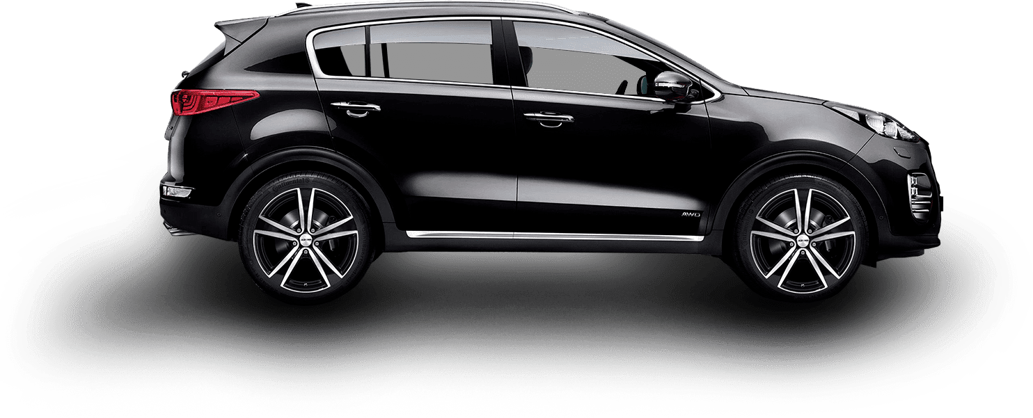
KIA Sportage 2019
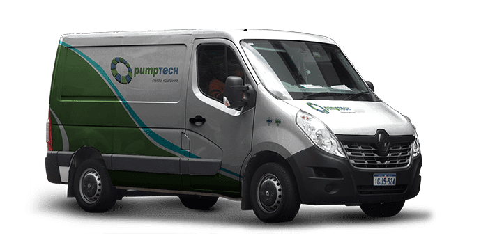
All presented cars were taken by color as the base ones, and were the standard of corporate colors, however, for other colors, options for using corporate style were also provided. In this case, dark black metallic.
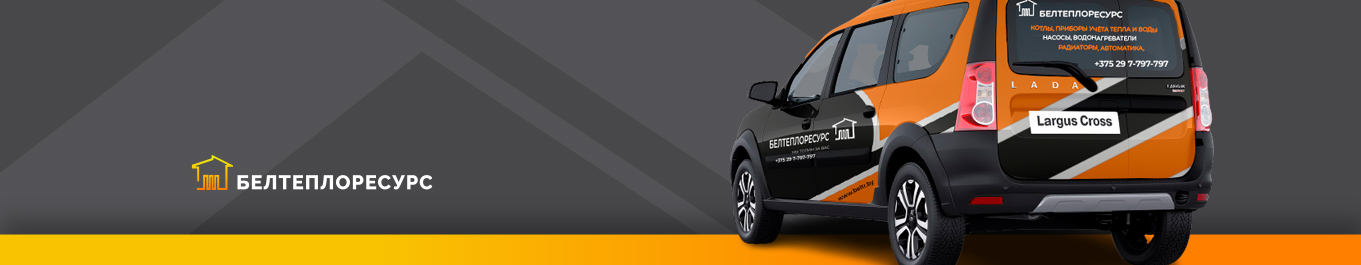
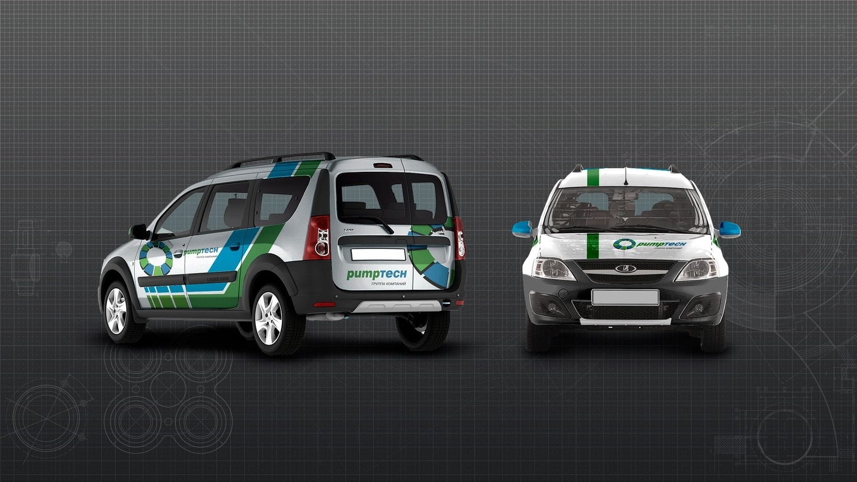
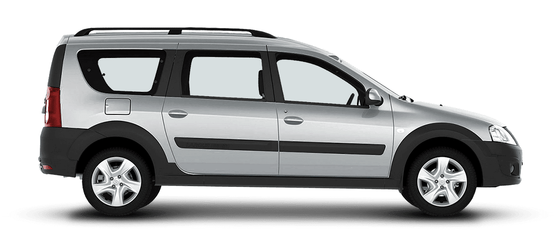
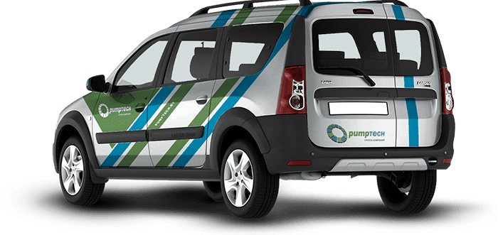
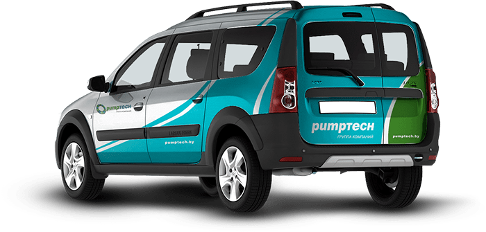
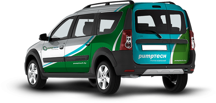
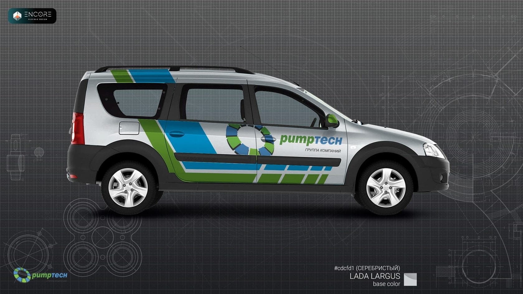
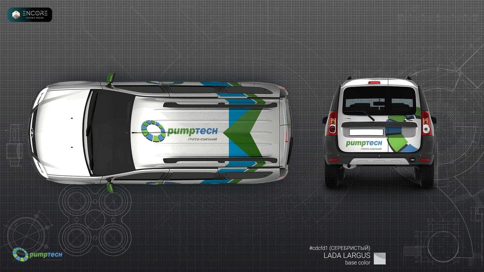
Service Lada Largus 2019
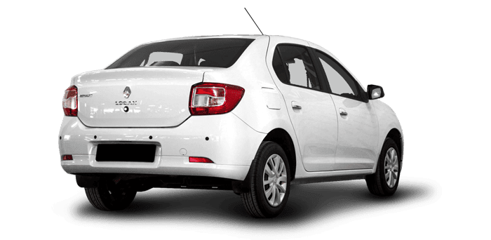
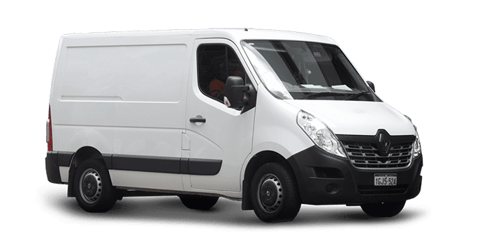
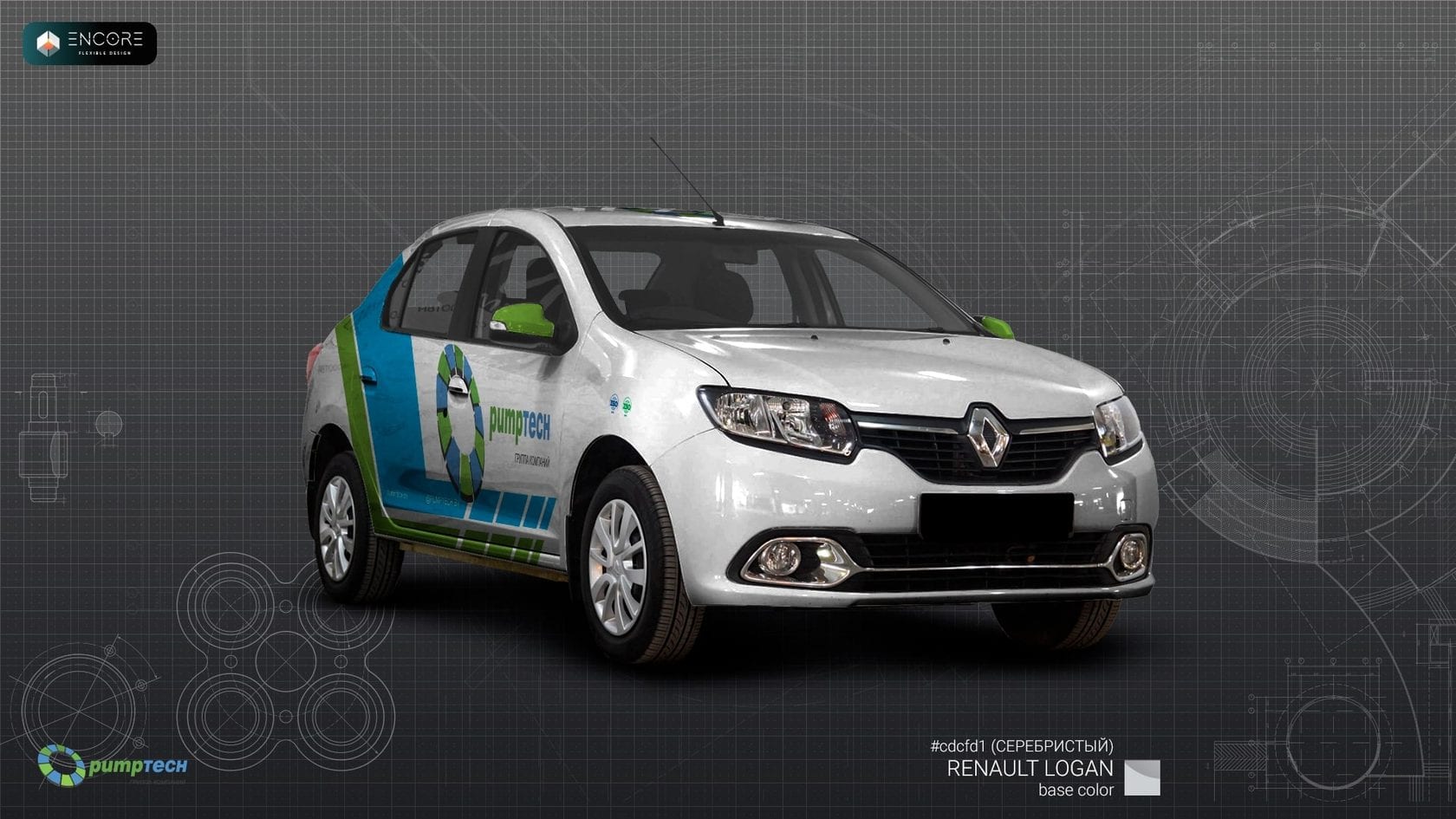
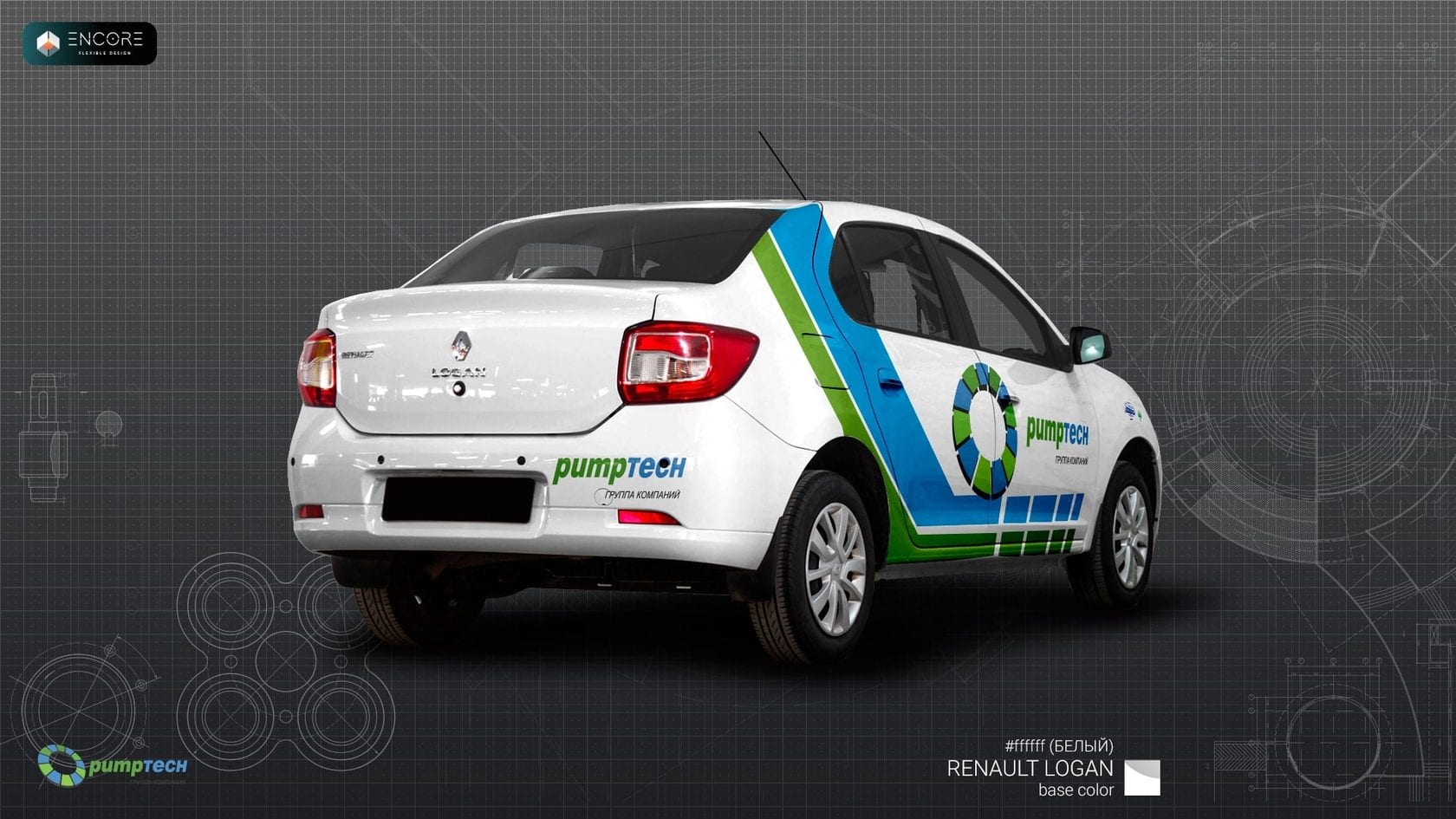
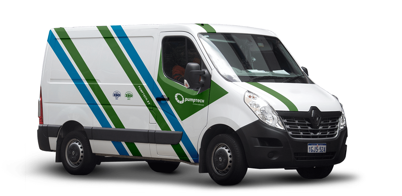
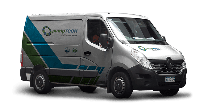
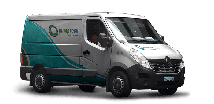
Service Renault Logan & Renault Master
What did we get?
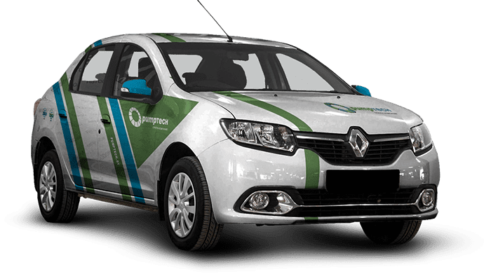
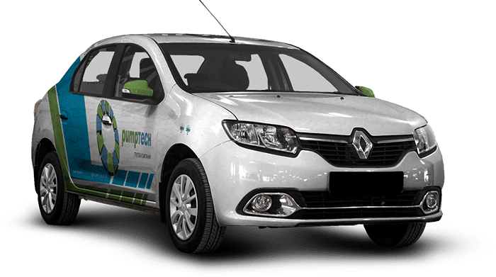
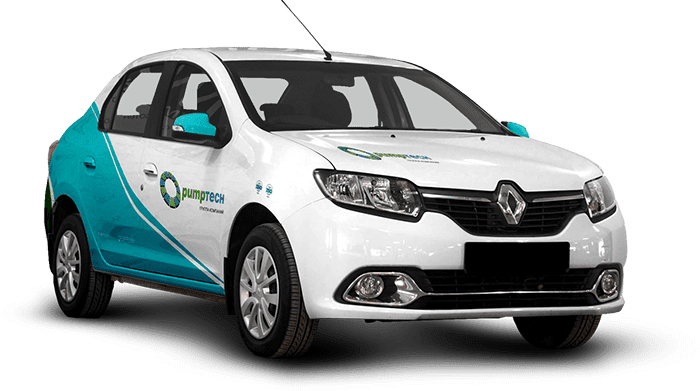
We have developed 4 variants of a unified corporate identity for each car. All of them involve the use in transport, in any of the colors laid down and provided in advance.
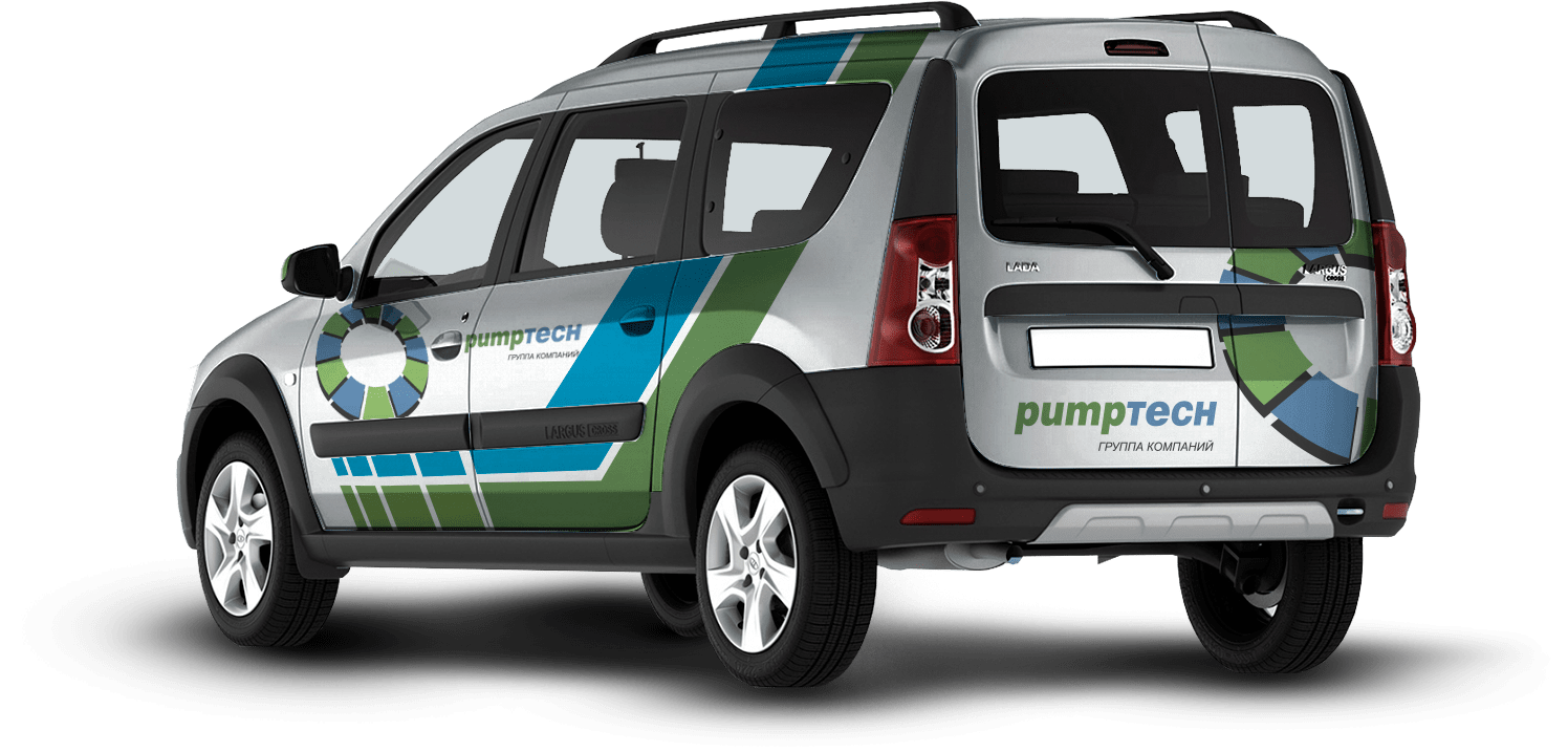
lada largus 2019 is a service car that performs a variety of tasks in the company and in the most unusual conditions. the design of the car classically emphasizes belonging to its group of companies and, without unnecessary advertising, is an element of the company’s unified corporate identity
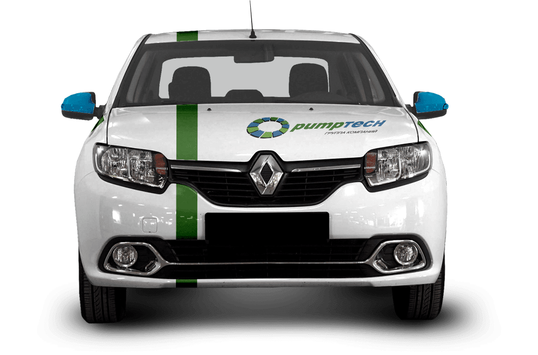
Like the previous Renault Logan car, it is the company’s main working vehicle, making trips to the most remote enterprises. is a symbol and a distinguishing mark of the company on the road and at the place of arrival.
KIA Sportage
The idea is not to make this car in the general genre of service cars, but retaining the style, conveying a different significance and purpose to the car. Since the car is representative and it is thanks to it that the most important international holdings, meetings and negotiations are carried out, the style was created as open and reliable. 12 lines — 12 constituent elements of the logo, located exactly parallel to each other — demonstrate the deep significance of using the holding’s symbols on cars. Demonstrates a desire to be open and reliable, fulfilling all the necessary requirements for the holding

How did it all end?
The presentation was held — the cars were branded as planned. As part of the project, 4 universal types of layout were designed, for all possible types of bodies and types of transport, the necessary guidelines and instructions for use were created. The client was satisfied, and our mutual cooperation within the framework of the global rebranding of the holding continues