Development of a corporate identity for the holding «PUMPTECH»
Brief summary of the project
We were tasked to develop an expressive corporate identity that evokes emotions of reliability and quality, which will be easily recognizable and at the same time distinguishable from competing companies. In the process of work, strategic planning was carried out, thanks to which the main goals and objectives for branding, promotion and creating a logo for the holding were determined.
Color scheme
A color scheme can evoke different associations among consumers, so it is important to choose a harmonious color combination that correctly conveys the message of the company. A lot of brands can be recognized by the color palette, as it is it that helps to stand out in any space. It is also important not to overdo it with the brightness of colors and their combination. Otherwise, the logo will only repel potential customers, not attract them.
Identity specialists recommend a thorough approach to the choice of color. The most popular colors for logos in the industry are: blue, yellow, green, gray and orange. Such a list was not created by chance, but on the basis of research data on the psychological and physiological perception of colors by humans. Shades of green and blue were chosen for the holding:
- Blue — associated with peace, contentment, contemplation, tradition and enduring values
- Green is the color of peace and harmony. It is the color of life, growth, prosperity, development. The associations that green evokes directly depend on its shade. So, gentle light green will be associated for most of us with lush grass, leaves, nature. This shade evokes feelings of freshness and joy.

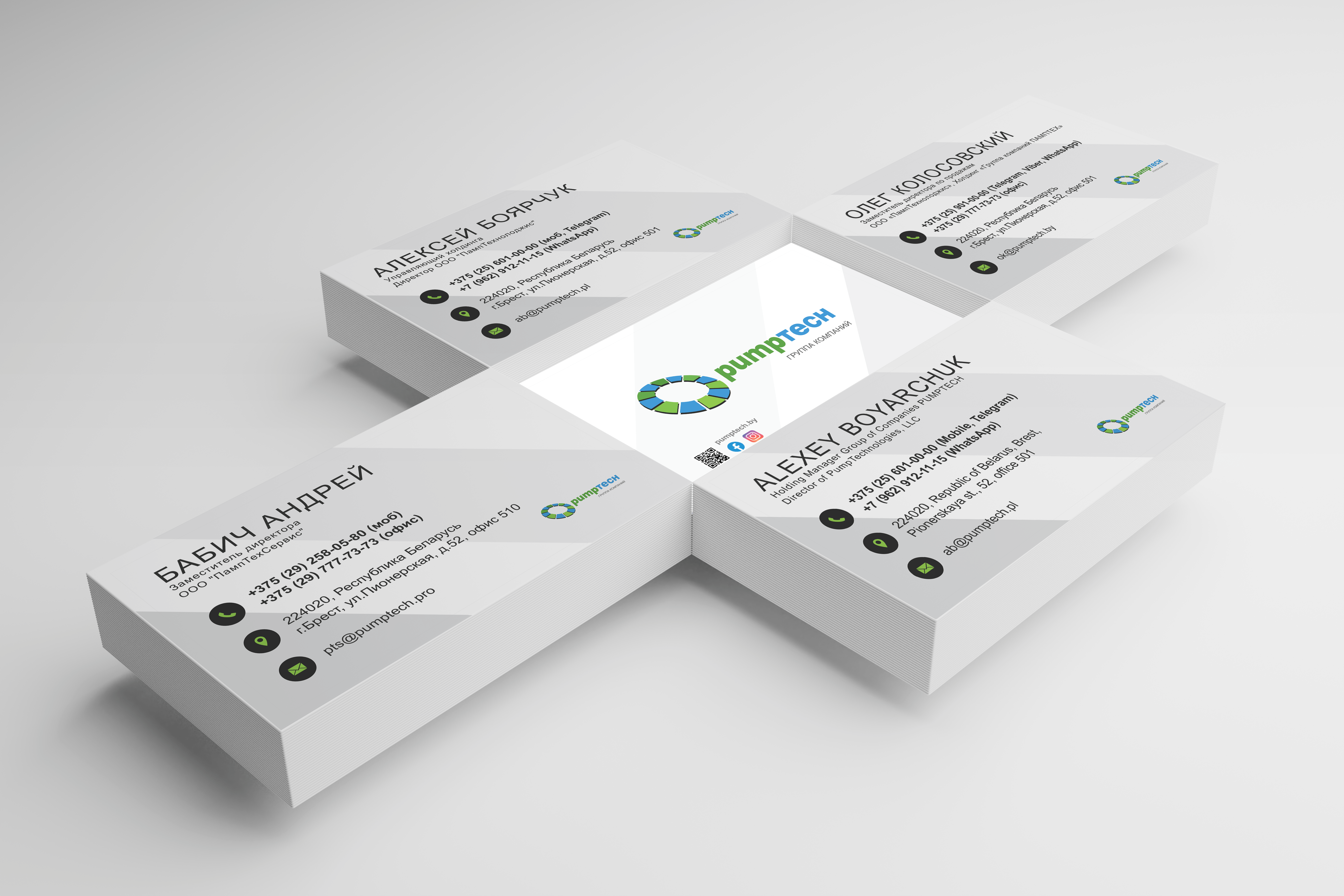
Business card design

Company logo, colors, corporate elements, fonts — all these are visual attributes that are used on corporate style media (flyers, letterheads, badges — whatever). From this we can conclude that the development of corporate identity should be given special attention. As a result of this work, it is possible to form a tool that will really help business development.
First of all, this is necessary in order to make the company more recognizable. Secondly, your firm will look more presentable to partners and clients. The corporate identity of the company increases the level of public confidence.
It was also important for the «PUMPTECH» holding to create its own corporate identity, since at present the market for goods and services is very saturated and in order not to get lost in the general flow, it is necessary to be recognizable.
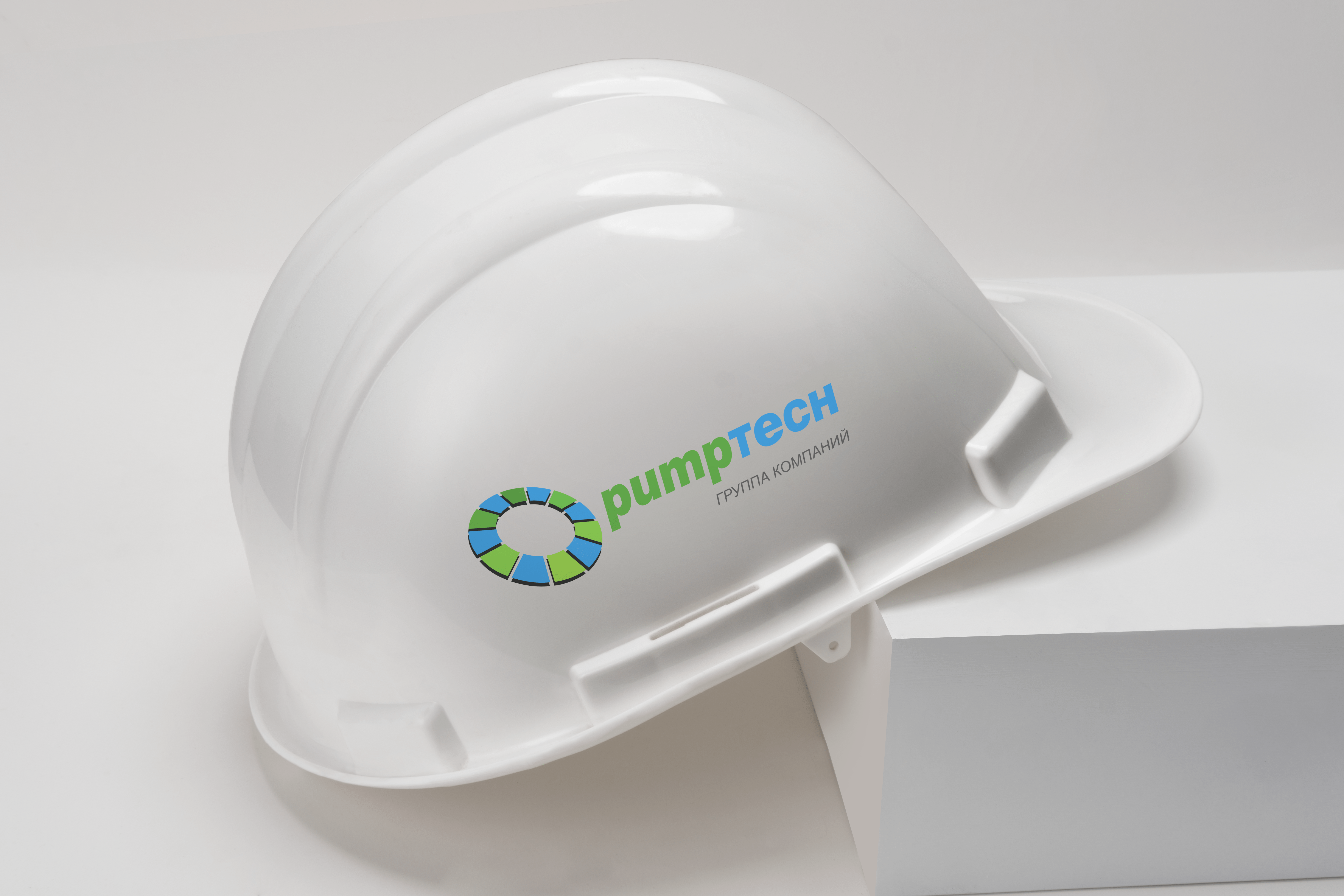
Style-forming graphics
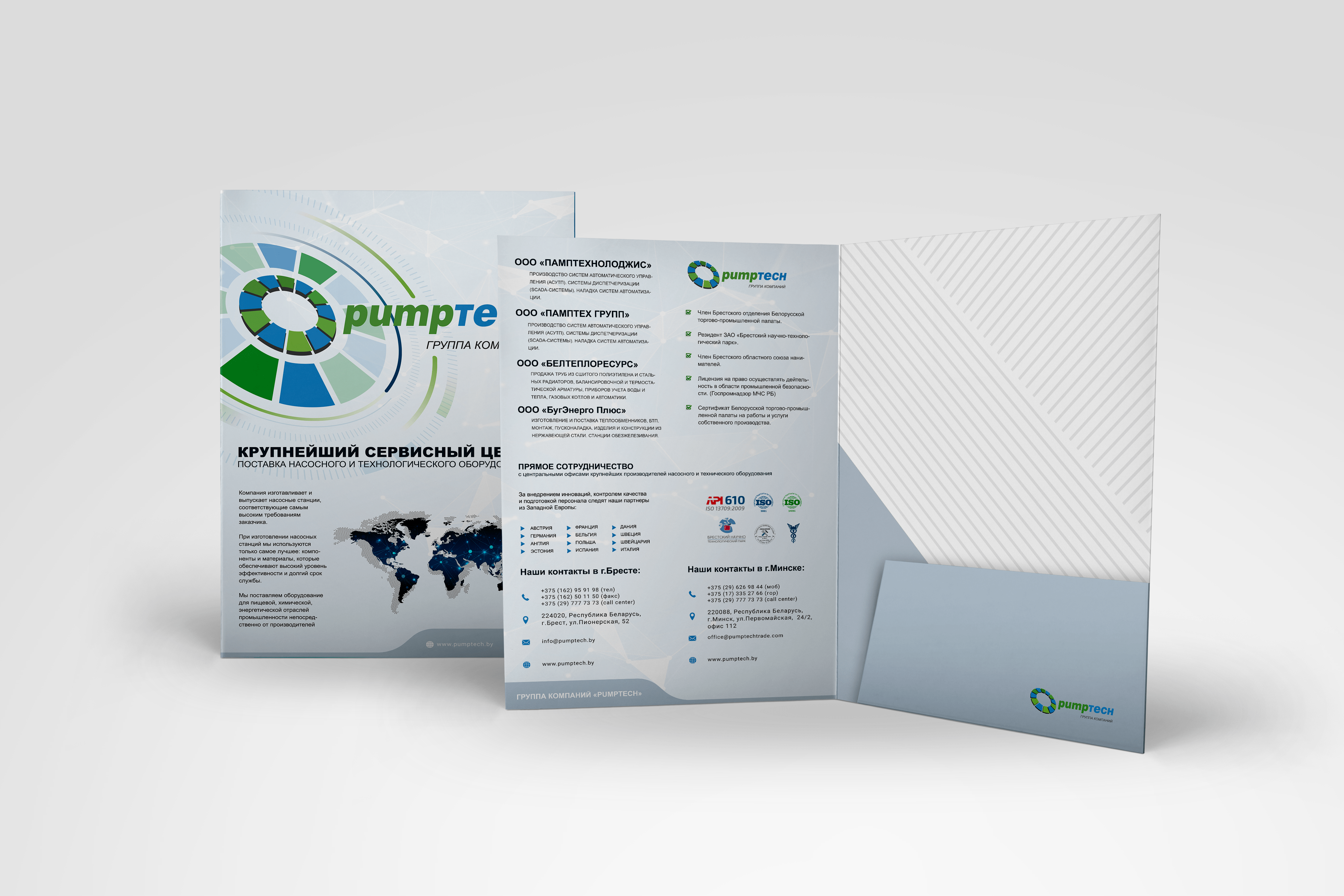
These are business cards, letterheads, brochures, envelopes and much more. With the help of graphic products, you can create and promote the corporate identity of the company in any field. The presence of paraphernalia has a positive effect on the brand image. When you come to a company, hotel, cafe and see the stylish design of the hall, brochures, signs, you get the feeling of a stable company that respects its customers.

Calendar
Almost all large companies annually release an image calendar for their partners and clients, which is distributed free of charge and is aimed at increasing loyalty to the company.

How did it all end?
The logo is placed where the target audience intersects with the company. It is used as an icon and is mounted in the header on the main page of the site, blog, placed on avatars and groups in social networks. All print advertising — from business cards to billboards — should include this element.