Development of corporate identity for the company «Belteploresurs»
Brief summary of the project
The client set us the task of developing a logo and corporate identity for the company. LLC «Belteploresurs» — qualified engineers providing consulting services, selection and supply of heating and water supply systems throughout Belarus. We are also engaged in the design and production of block heat points. Contact us.
The main activity of the company is the wholesale trade of XLPE pipes and fittings for them, steel panel radiators, balancing and thermostatic fittings, gas boilers and automation, water and heat meters.
Therefore, the result had to simultaneously correspond to modern trends, but at the same time maintain a business style.
Logo development
The client filled out the brief in detail and our team understood exactly what the client was waiting for
— what is the target audience of the business and what needs to be done so that the corporate identity works positively for the company’s image in the eyes of consumers and partners.
It was important to show the stability of the company and the level of quality of services.
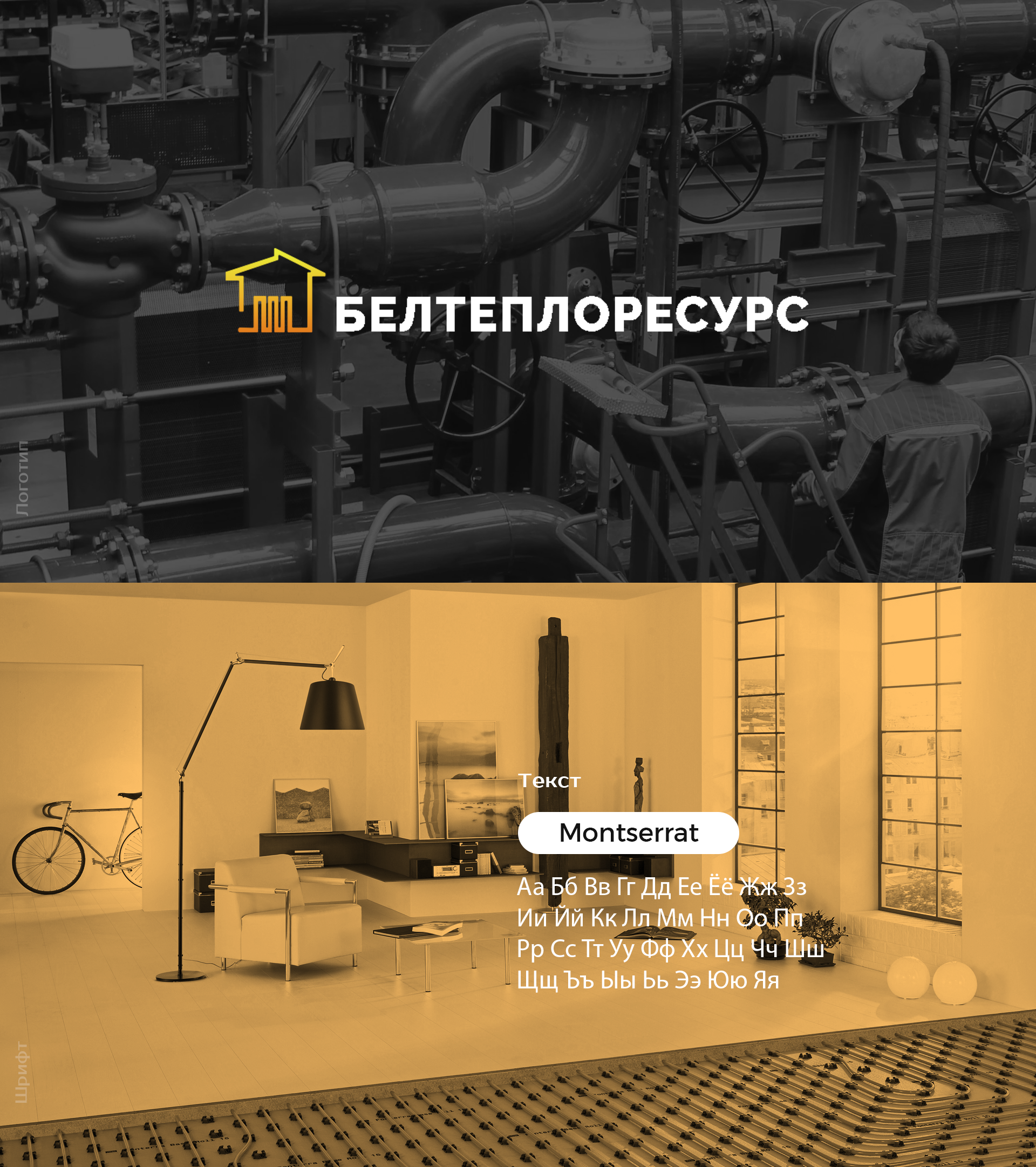
We have created a logo, its graphic part is stylish and concise. We used a bold sans-serif font, so visually the logo looks reliable.
The logo did not want to use a hodgepodge of bright colors or symbols that are difficult to distinguish, as this makes it difficult to remember. We settled on using a combined logo. For the accent, they chose orange, which is associated with warmth and comfort.
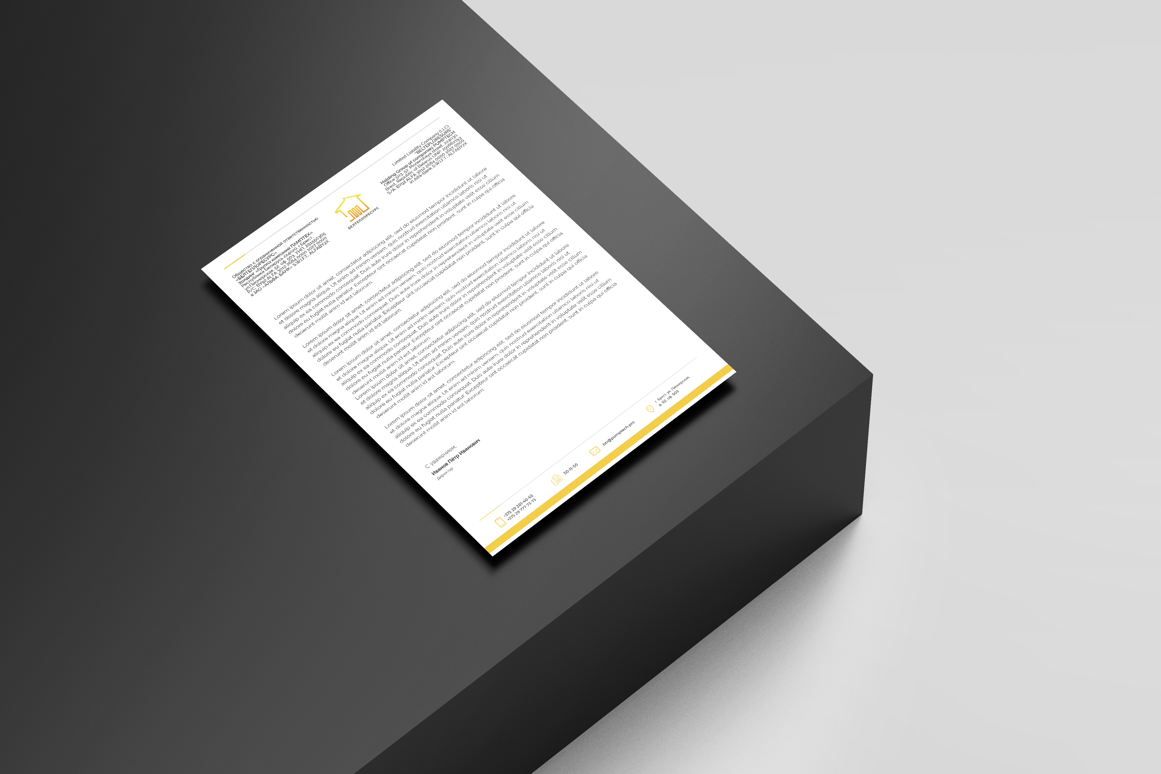
Letterhead design
We also developed a letterhead design so that company documents will also be branded, which increases the trust of partners.
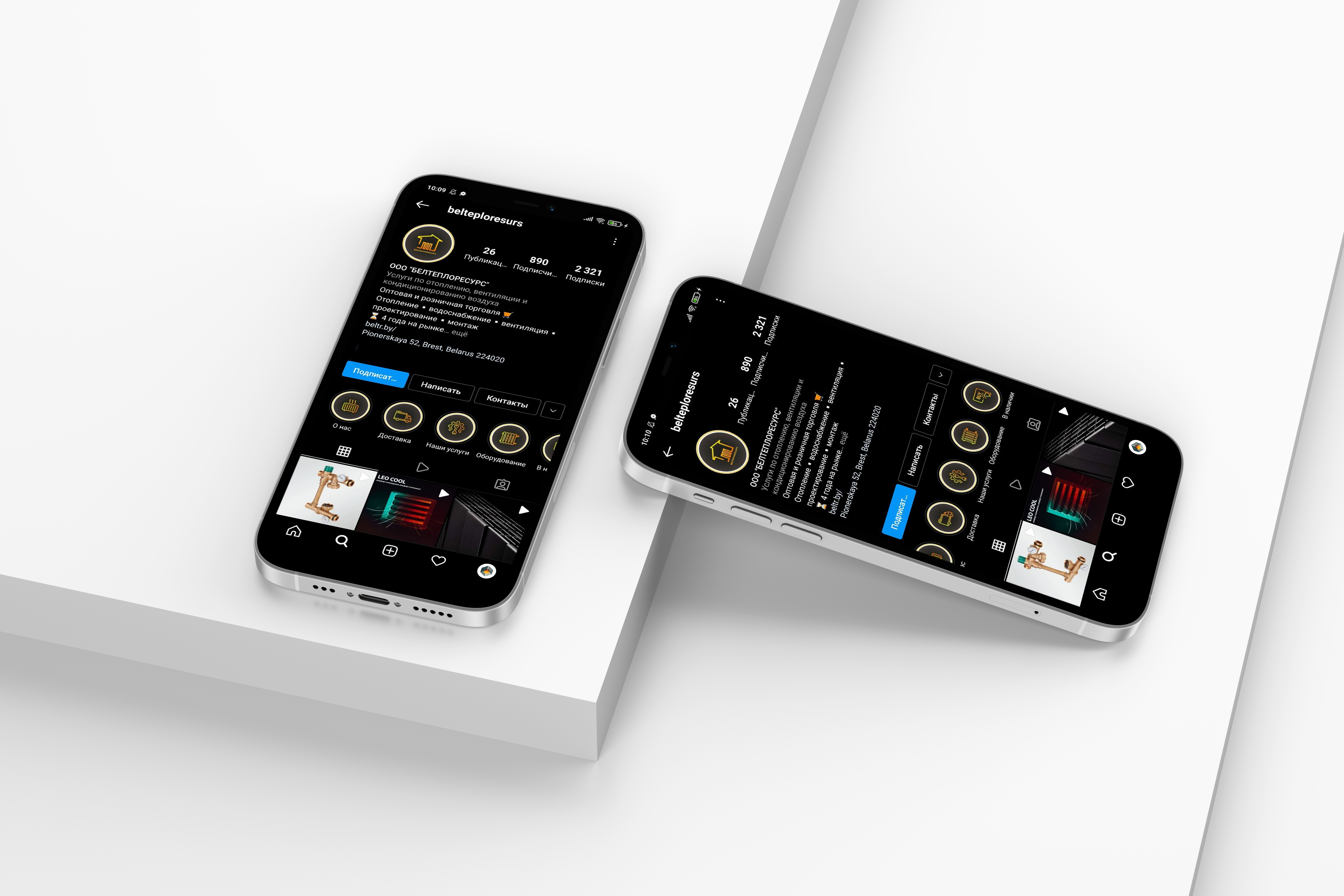
Design highlights for instagram
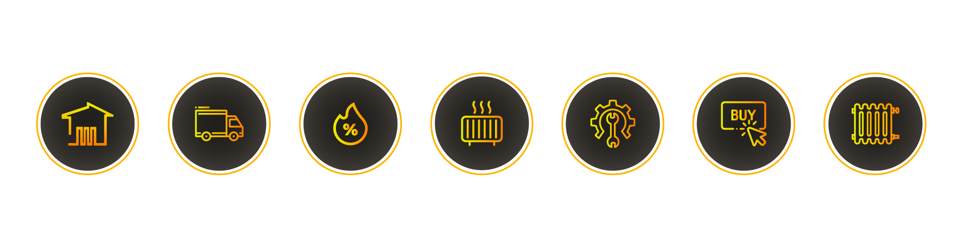
Setting up an Instagram account
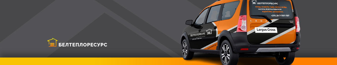
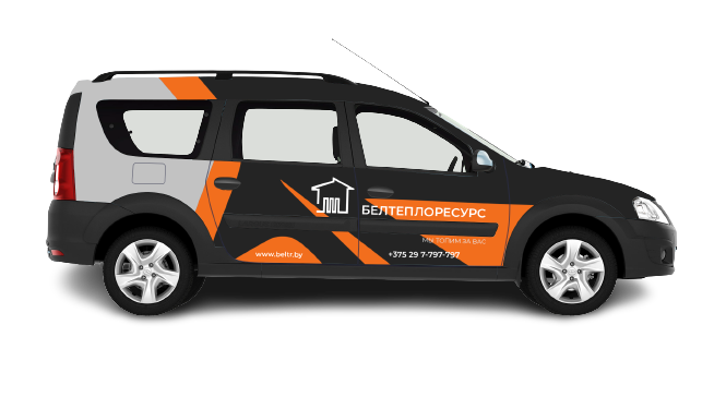
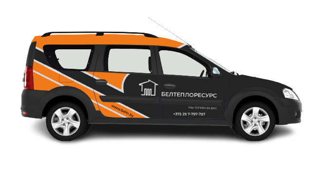
Car branding
All presented cars were taken by color as the base ones, and were the standard of corporate colors, however, for other colors, options for using corporate style were also provided. In this case, dark black metallic.

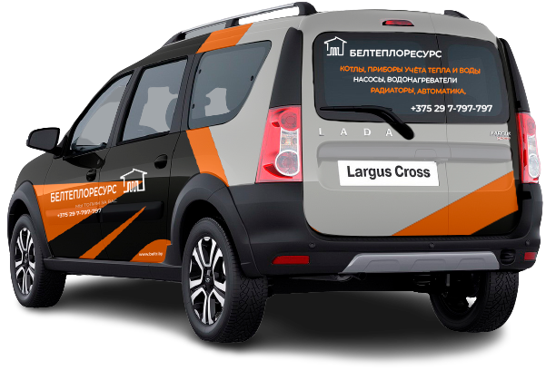
lada largus 2020 is a service car that performs a variety of tasks in the company and in the most unusual conditions. the design of the car classically emphasizes belonging to its group of companies and, without unnecessary advertising, is an element of the company’s unified corporate identity
How did it all end?
The new identity is successfully used online and offline.
Thanks to the change in the logo, it was possible to show the individuality of the company.
The developed solution looks easy, friendly and modern, thanks to which the company attracts more customers and is quickly remembered.