How not to create feedback forms
A moment of obvious things
Feedback forms are needed so that the visitor can communicate with the brand. Ask for help, ask, complain, offer something. For some businesses, it is a conversion tool — that is, you receive applications from it. The thing is important, but you can screw it up very easily. Learn from the master.
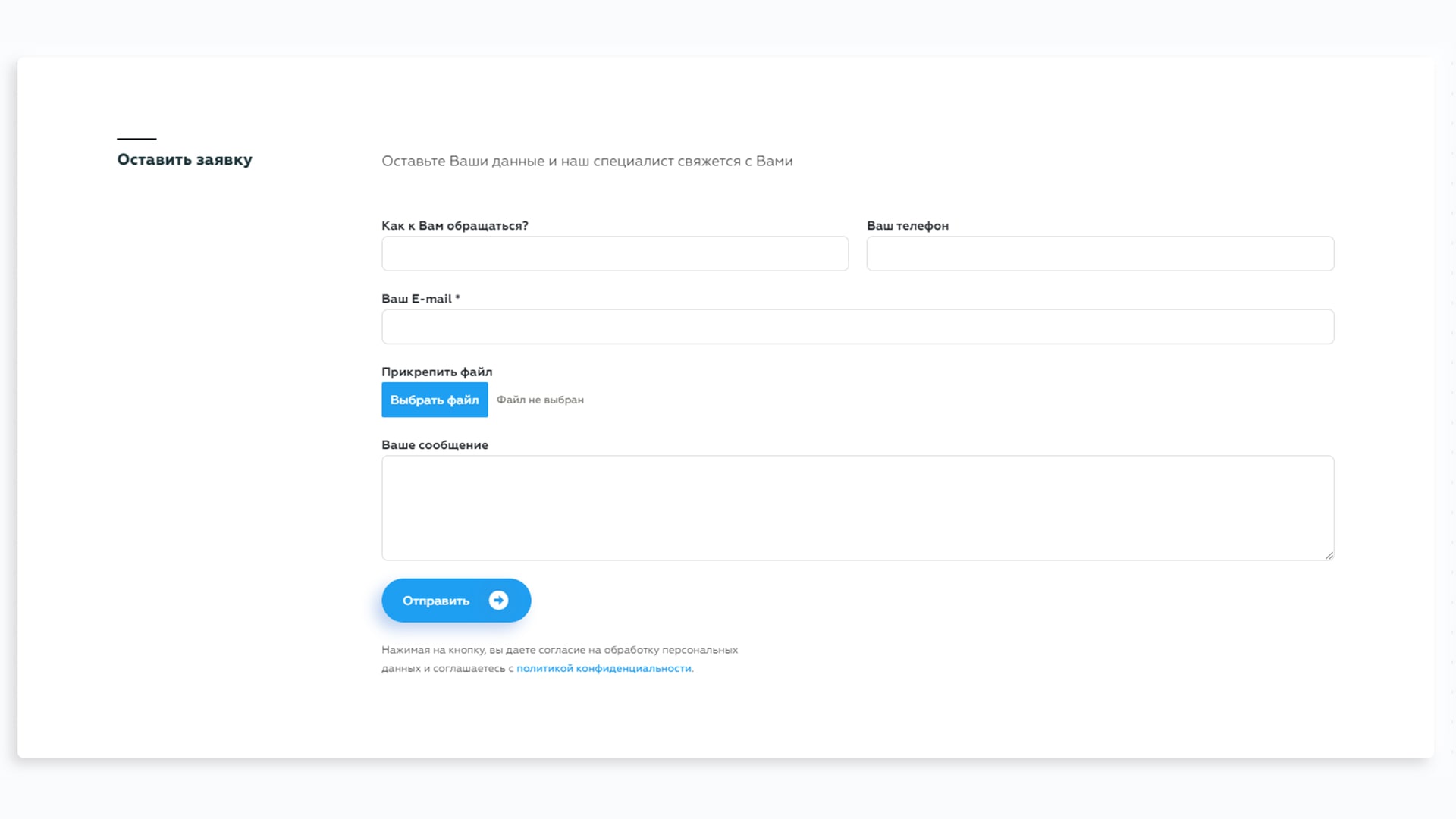
Original
Everything should look something like this, unless, of course, you want to complicate the life of visitors. The form is noticeable, it is clear what she wants from you. I quickly filled it out and went to wait for an answer. And now let’s connect our crazy genius to the work.
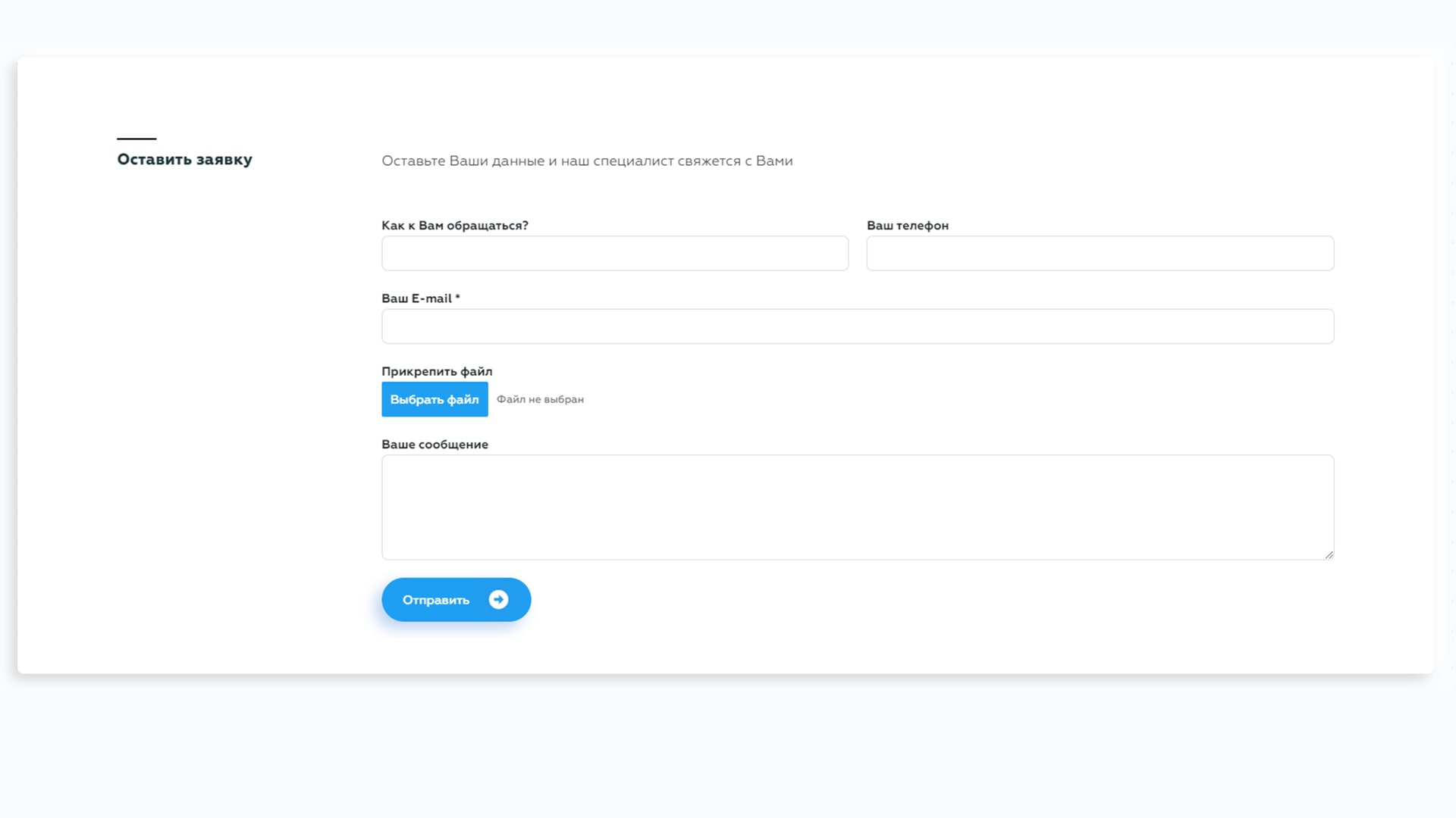
Version: ignore privacy policy
On all counts, a good form, except for a small nuance: someone forgot to add the checkbox «I agree to the processing of personal data» (or a disclaimer, as in the example above).
Verdict: For such a mild form of amnesia, you can be fined
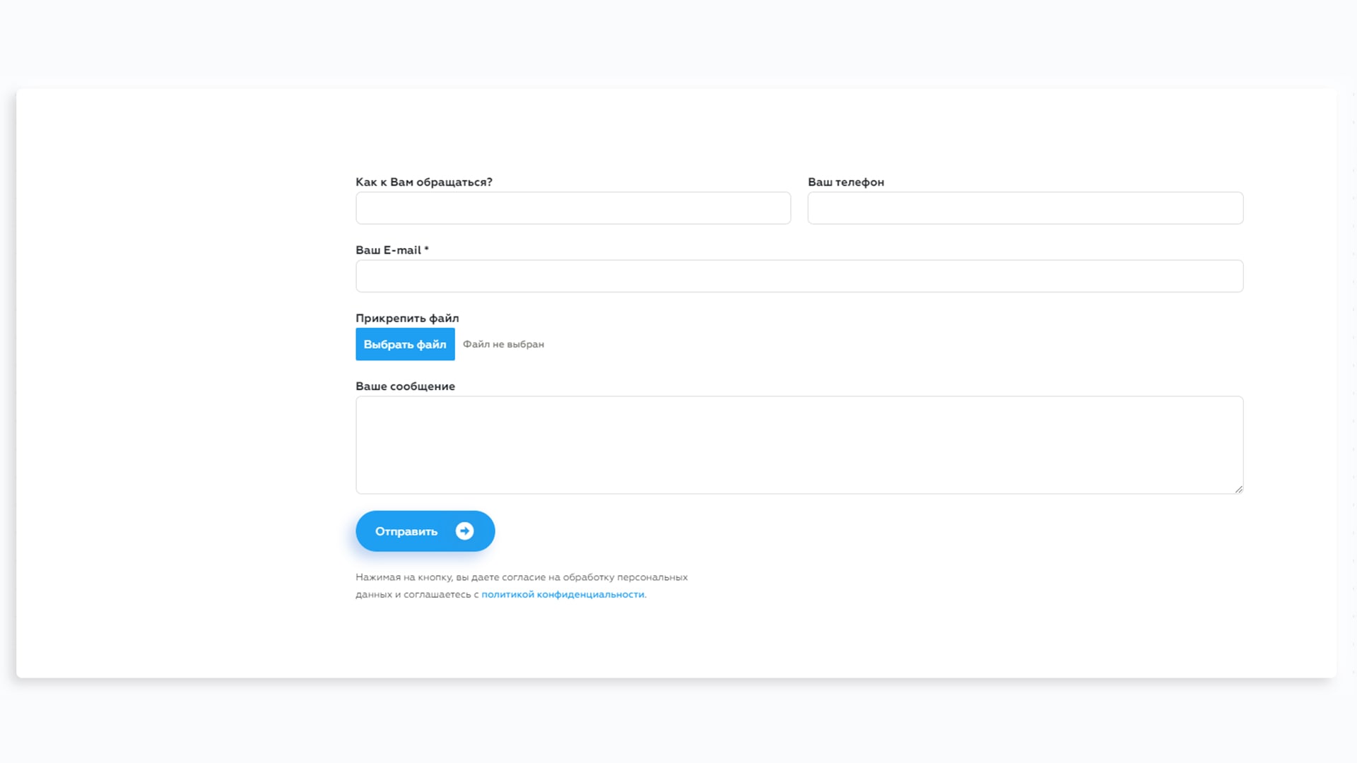
Version: skip explanations
Freak form. No “leave the phone and we will contact you” and all that other stuff. Immediately “hey, give the phone here! What if I find it?»
Verdict: not cool. A small comment on the form will not be superfluous — all the more so, there you can write about the response time or hint at the obligation to fill in the «contact» field. So do not forget about the explanatory text, at least leave the title.
Version: add a bunch of fields
Now the form looks more like a questionnaire on a dating site. Name, rank, where your unit is located, surname, patronymic, gender, marital status, number of children, religion.
Verdict: instead of making one, maximum two, mandatory fields (the very same “contact” and “how to contact you”), your bright crested bird arranges a questionnaire for customer segmentation. A smart move? (No).
Version: making fields required
“The last version was not so bad,” the user thought. “The previous version didn’t suffer enough,” you chuckle slyly AND make all fields mandatory.
Verdict: turned out to be a classic example of «how not to». Communication between the brand and the visitor should be easy and natural, and not as if a firing squad is aiming at you, and a spotlight is shining right in your face.
Version: in the heat of validation
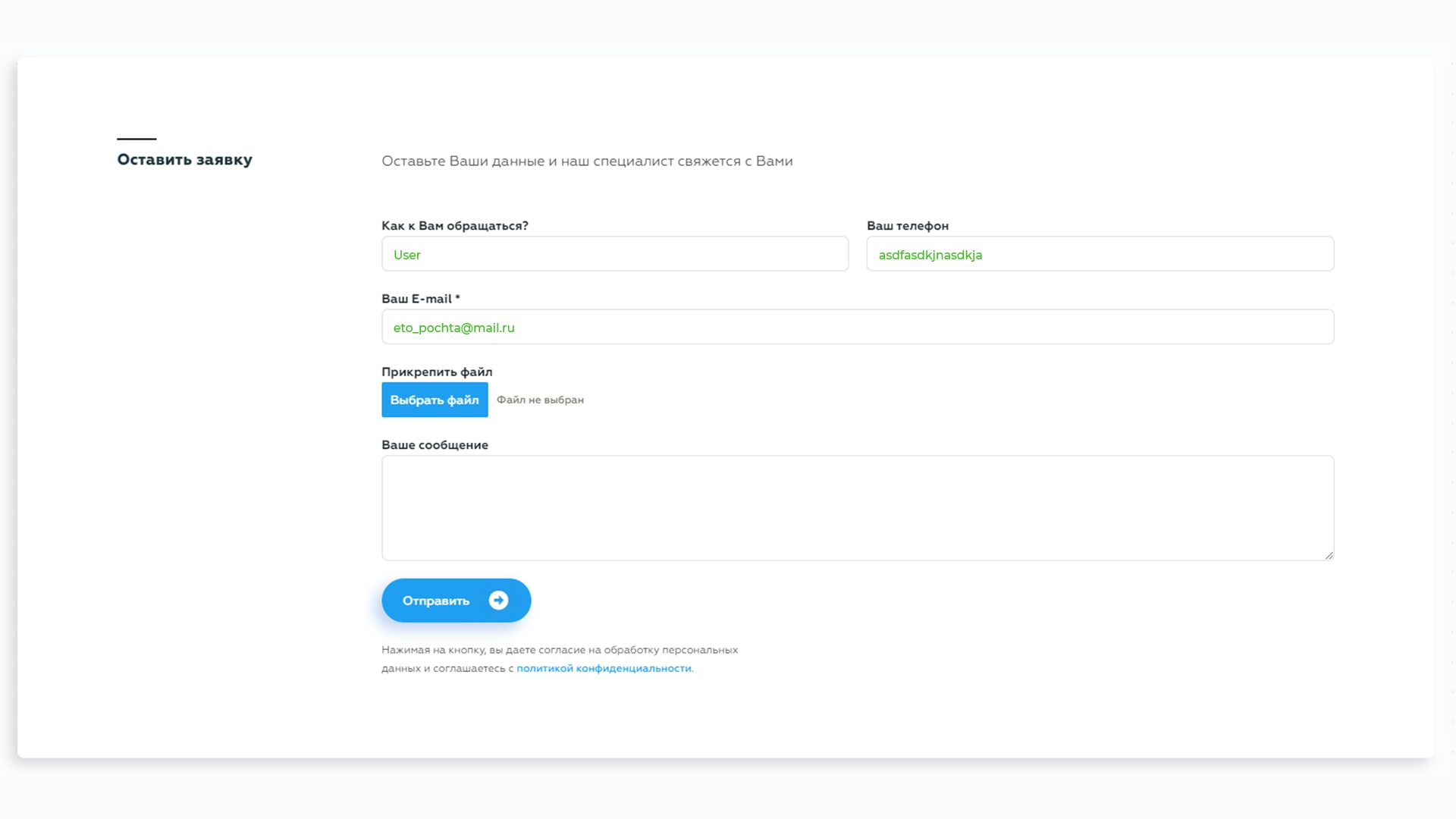
The user can enter anything and anywhere. And at the same time, his data will not be validated in any way. That is, for example, in the «phone» field, you can write asdfasdkjnasdkja, and in the «your email» field — eto_pochta@mail.ru. The form will accept everything and thank you for contacting. Freedom of action, they said.
Verdict: freedom is freedom, but then you will get a bunch of negativity from asdfasdkjnasdkja, which has not been answered for a week. Yes, he himself is to blame and crookedly wrote mail and phone — but you will be responsible for this.
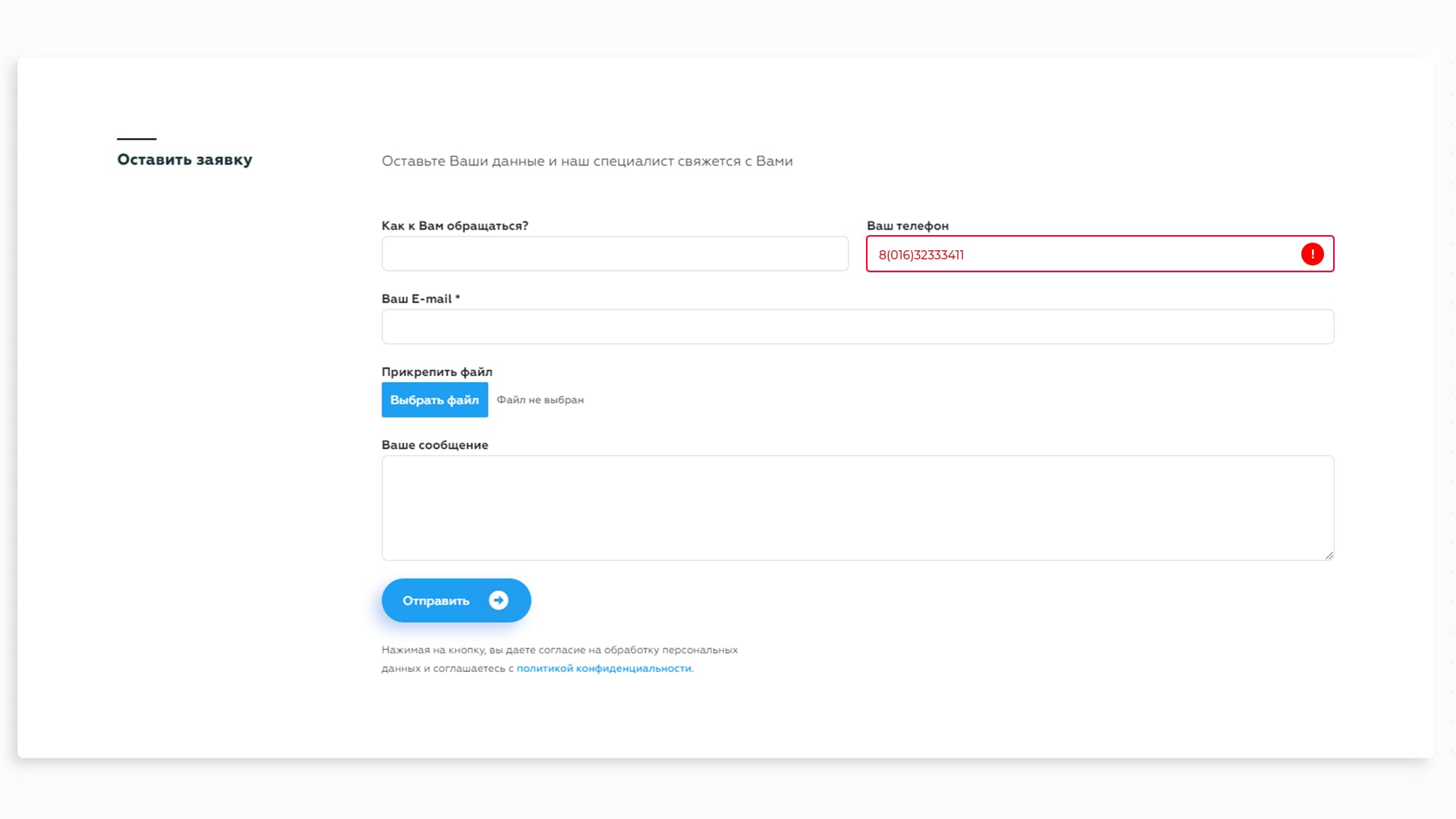
Version: in hell hints
The user diligently enters the data, sends and sees — surprise surprise! — «Incorrect phone number entered.» Why, what exactly is incorrect — come on, turn on your imagination, guess for yourself.
Verdict: if you want the user to fill in the fields without errors, then tell me what exactly his mistake is.
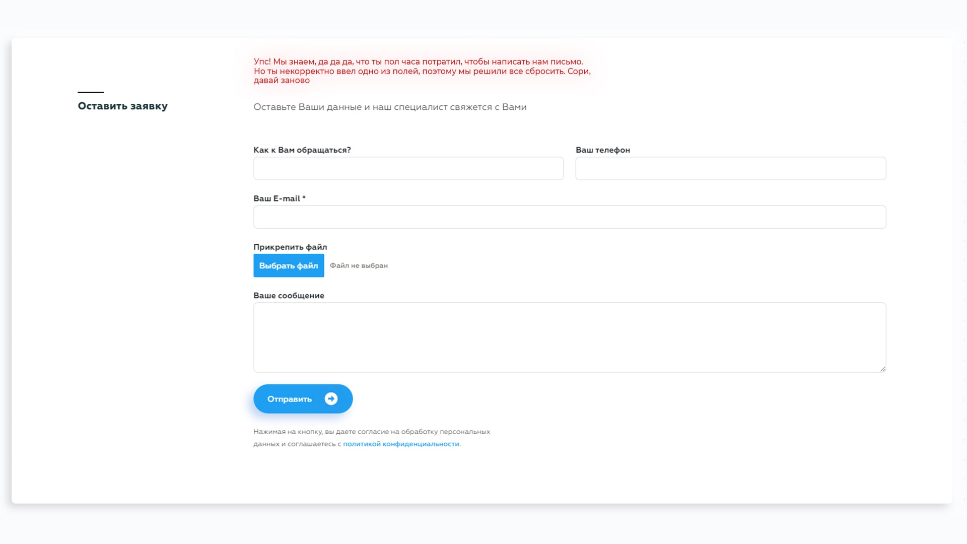
Version: Let me drop everything?!
The user diligently enters data, sends and sees — surprise surprise! “Something entered incorrectly.” Why, what exactly is incorrect and where — come on, turn on your imagination, guess for yourself.
Verdict: A sure way to piss off a potential client. Do not do it this way.
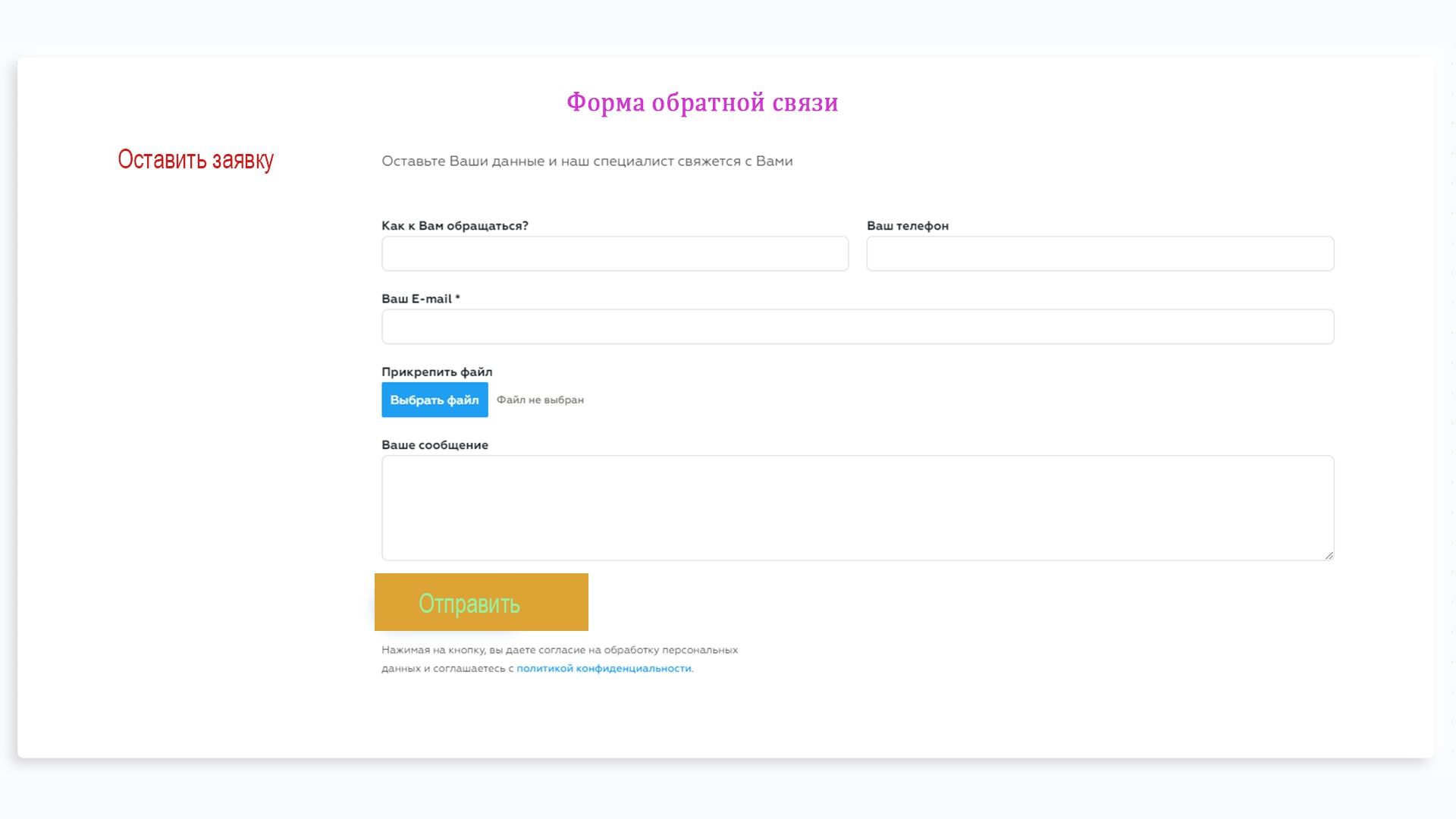
Version: do not in style
The form is not in the style of the site — this is such a thing that it would seem that it would be possible … it’s okay, but something is not right here. About how to turn on the first channel at nine in the evening and see that Sergey Druzhko is reading the news.
Verdict: after all, you have a brand book, a guideline, everything. You should not buy a left-handed service with a feedback form (even a very good one) in order to give up on the design later.
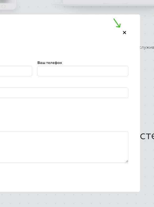
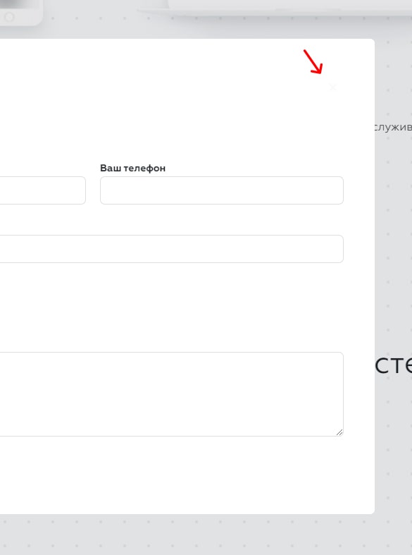
Version: remove the «close» button
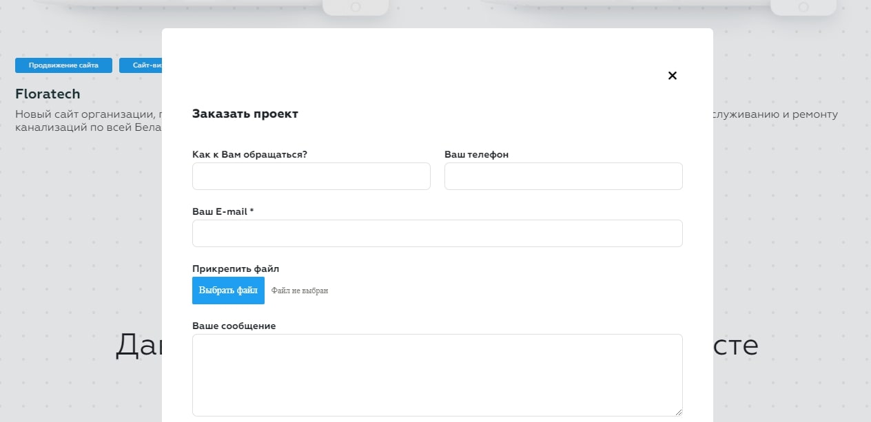
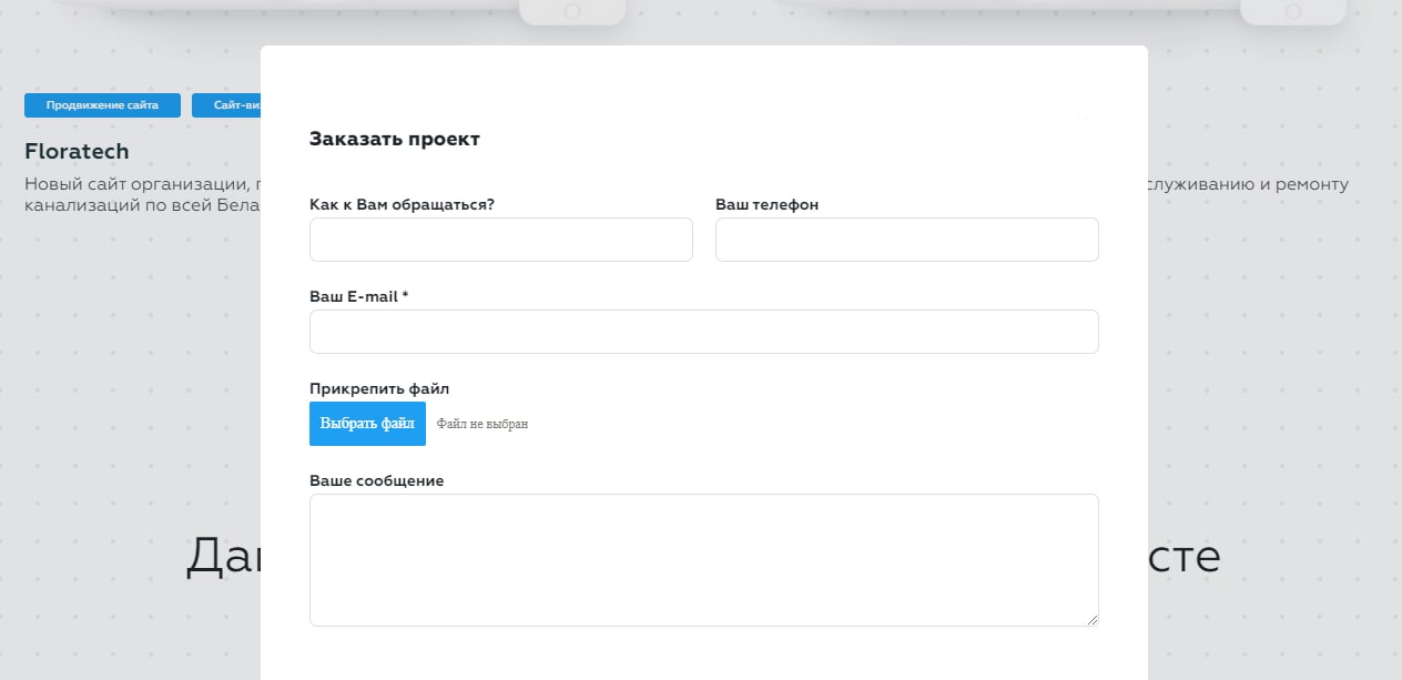
Yes, you may ask why there was no cross in the examples above! For reference, there were examples not of a model window, but of a form built into the structure of the site. For you to objectively understand what it is about — please, an example of a modal window is below:
Good, fit form, with one small caveat. She leaves no choice. Fill in or die — something like this message should be read behind the form without the ability to close it.
Verdict: even if the form is so beautiful that you can’t get enough of it, there should still be a «close» button.
Bonus: mysteriously silent after form submission
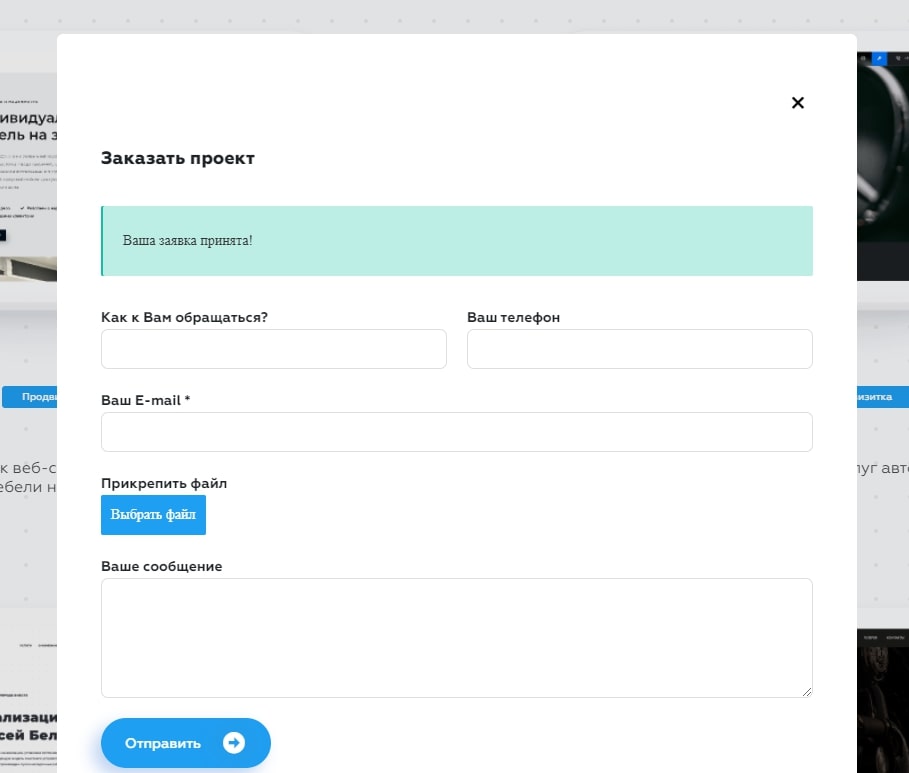
The user filled out the form, submitted it, and nothing. The form just closed. What to do? Fill out again? Hoping everything will be ok? Forgetting to say that everything went well is a sure way to spoil the impression.
Verdict: after clicking on the «send» button, a notification should appear, something like this: «Thank you! Your application has been sent. Our experts will call back in an hour.» And then it’s all in vain.

